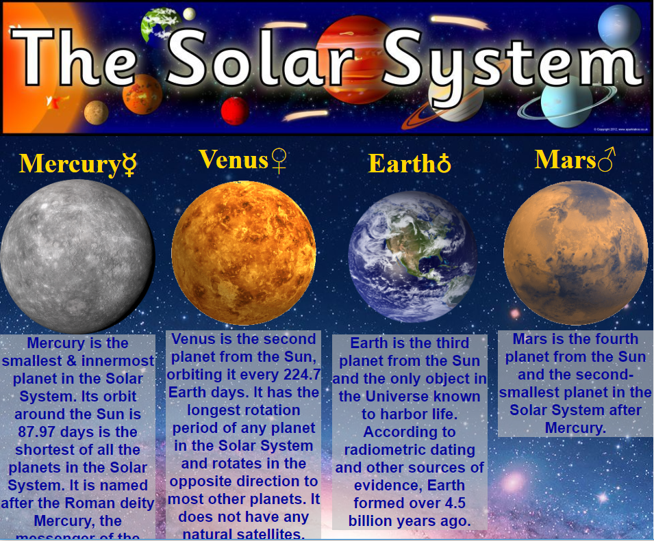
Today, many people use their phone or tablet for web surfacing. Fewer and fewer people view websites on desktop or laptop computers. This new trend, of viewing websites on varying screen sizes, creates a problem with web formatting. A website that looks incredible on a laptop might appear different on a smaller phone or tablet screen. To address this situation, web designers create the website in three different formats so that it will look sharp and professional for every screen size.
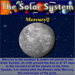
I built the Solar System web page to showcase responsive formatting. Responsive formatting allows the web page to automatically resize itself and perfectly fit any size screen—from a giant big screen TV to a small smart phone screen. Press the “Try it Yourself” button to see how the web page reformats to various screen sizes.
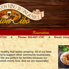
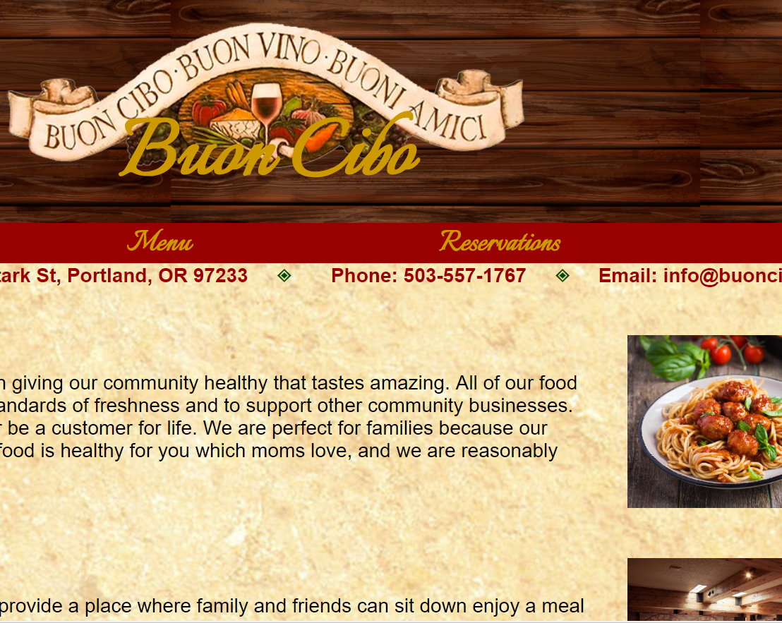
This is an example of what a restaurant website. “Buon Cibo” is an example of a locally owned and operated Italian restaurant. To create a feeling of longevity and cozy Italian influence, I used the colors of the Italian flag. The deep red that is reminiscent of a red wine and the deep green complements the red nicely. To break up the color and add visual interest to the page I used the textures of wood and aged paper. These textures are easily identified as having an Italian influence. The colors and textures work together to create the feel that Buon Cibo is a well-established owned and operated by a local community family. Since Italy, and good restaurants are known for their food, I made sure to include pictures of the dishes served at Buon Cibo. The contact information is prominently so that people can easily find and/or contact the restaurant.
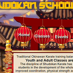
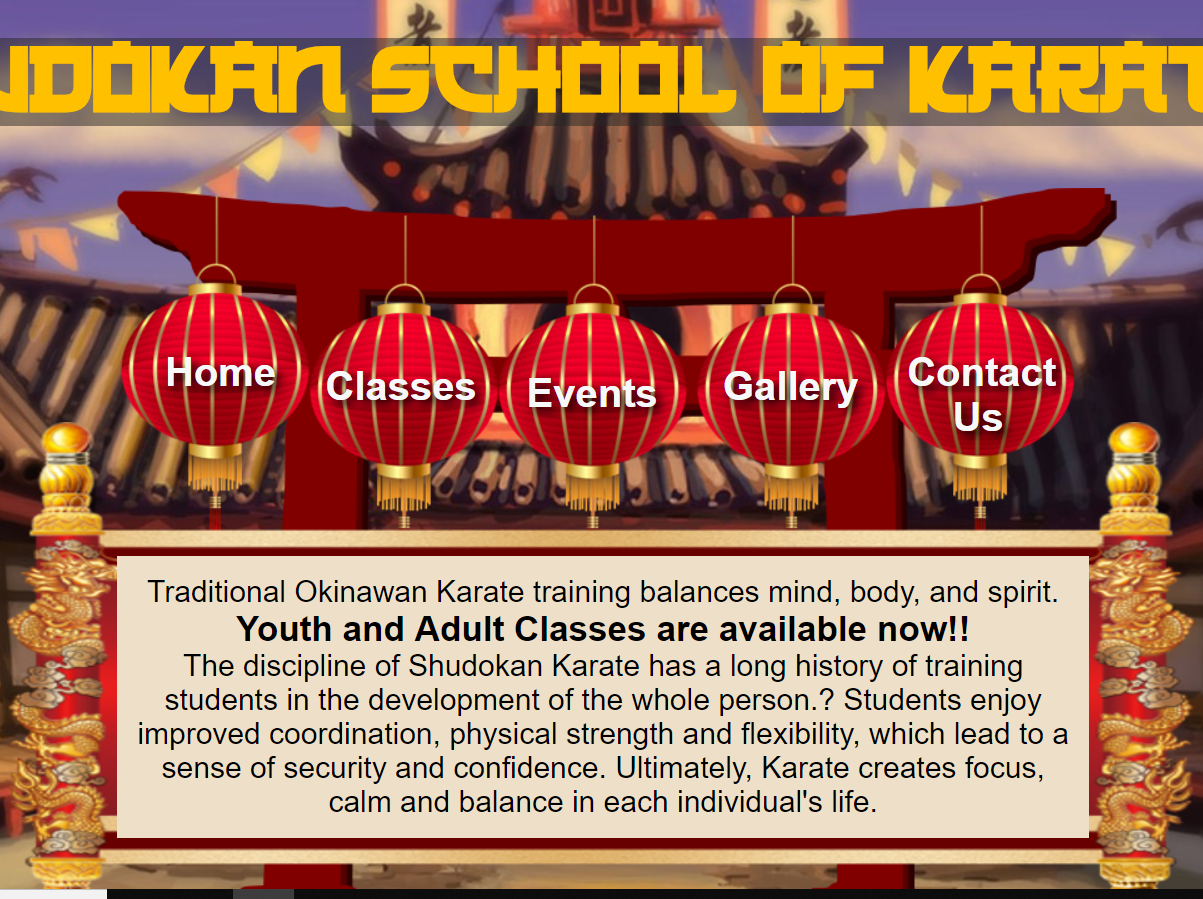
This is a mockup for a local Milwaukie Karate School. The design concept for this mockup is to make the home page look like the outside of a dojo and all the other pages like the interior walls. As you move through the website it feels like you were moving from room to room within the dojo. The 2 pages you see are the “Home Page” and the “Classes Page”. These pages were created as a mockup for a pitch. Feel free to look at the other pages, but keep in mind they are images and not clickable web pages.
Home Page: I created the home page from multiple images. The lantern icons act as the navigation for the website. My plan is to have the lantern icons glow when you hover over them with the mouse. The title font is Japanese 3000. This is a font that is comfortable to read and gives a Japenese flavor to to website.
Classes Page: Keeping with the theme of the website, the classes page looks like a framed poster on the wall of the dogo. All the information for the karate classes can be found on this page. Name plates are used as a navigation tool to keep the eyes on the page information.
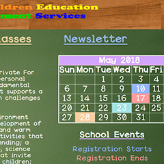
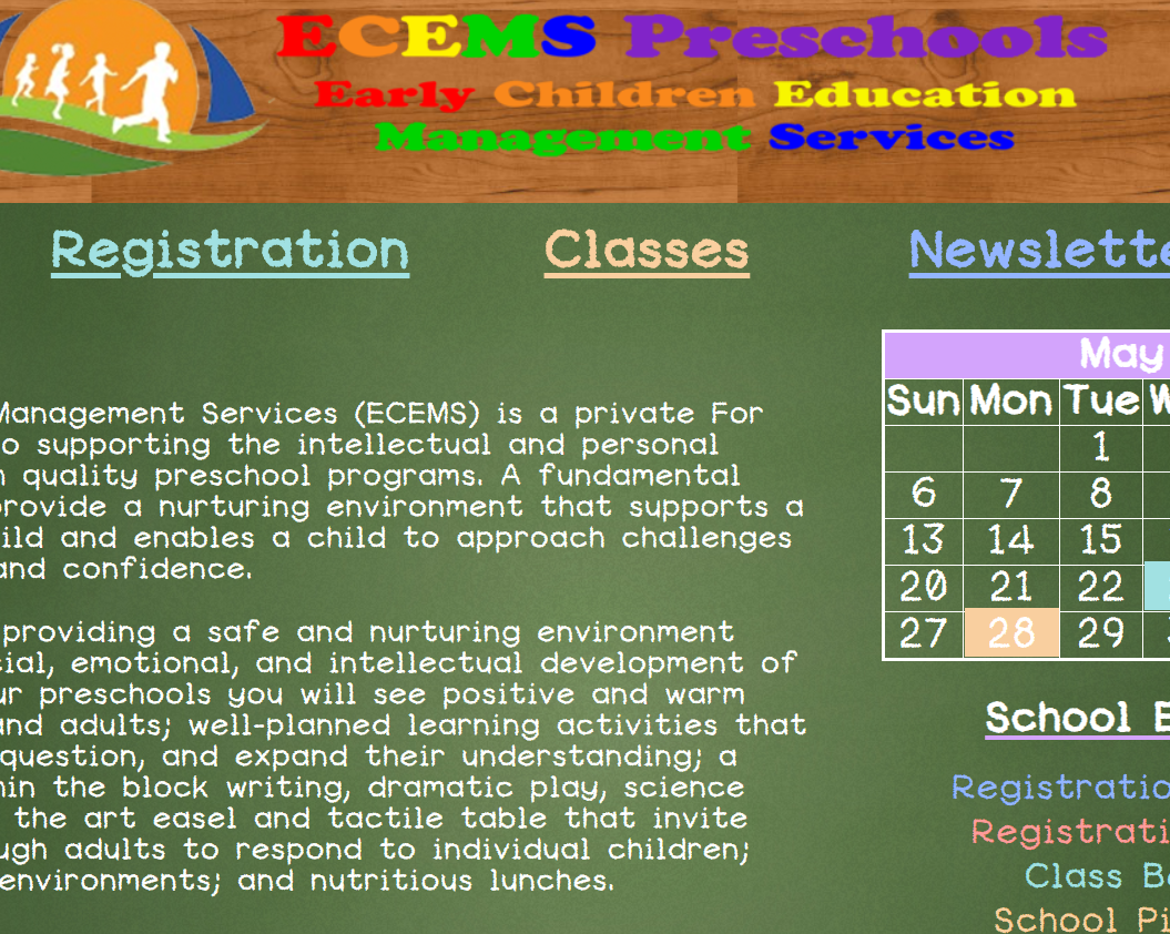
This is a website I built for Early Childhood Educational Management Services (ECEMS), a Milwaukie preschool with three separate locations. I worked closely with the Director to develop a website that placed all pertinent parent information on an easily accessible website. Sadly, the owner of the preschool retired a couple of years after setting up the website and no longer uses it.
Although the Director did not have a clear vision of what she wanted, she did have a strong vision of what she did not! I created two possible home pages for the website. Looking at these mockups, the Director made it clear she did not want a traditional primary color scheme. I suggested using more earthy tones of blue, green, orange, and yellow. These colors were also reflected in the preschool logo. Although each of the colors appeared on all pages of the website, each page had its own main color. This makes the website easier to navigate as the color of the navigation tools changes as the page changes.
Original Design: Simplicity was the concept for this design. The website needed to allow families to easily find key information, to display pictures for families to view, and to keep parents informed about school activities. Ultimately the Director chose this design for the website.
Chalkboard Design: For this design I went with a more novelty approach. An iconic part of school are chalkboards. I found an image of a huge background image of a chalkboard. Next, I found an easy to read text that mimicked chalk. Then, I used text colors to match colored chalk. Finally, I added a chalk drawing at the bottom of the page to add a sense of childhood whimsy. Afterall, what child doesn’t look for an opportunity to draw on a chalkboard?
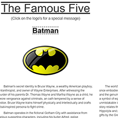
This web page shows my familiarity with a popular web tool called Bootstrap. Bootstrap makes it easier for web designers to format their websites and use special features. One feature helped me to create the large banner image at the top of the page, the photo carousel, and the hidden text boxes that appear when you click on each of the logos near the bottom of the page.
Bootstrap can be a very helpful tool to shorten the time it takes to build a website. I am now familiar enough with Bootstrap to alter/override bootstrap’s code. This way, I can use what I need and alter/leave out what I do not need. Every website will look exactly alike if Bootstrap code is not overridden or altered. Using Bootstrap as a tool to alter and override allows the designer to create a more unique and individual website and a greater impact on the customer.A good example of this individualization can be found in the styling of the navigation bar at the top of the page. This feature is not offered through Bootstrap, so I figured out how to achieve this style all on my own.
On this web page you will find a vote counter. This function can be used to track customer interests and preferences. When you open the page there are two vacation options. When the consumer makes a choice, two new options are presented and the vote tallies for each selection in the chart below. This can feature counter can be used to determine one person’s interests or the collective interest of a group of people.
This can provide useful information to the business. For example, a baker might set up a consumer vote to gage interest in possible new flavors. Not only would this act as customer research, but would also act as marketing to announce when new flavors are launched.
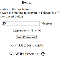
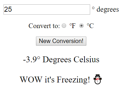
This web page features a temperature converter. I built the website to convert temperatures from Fahrenheit (℉) to Celsius (℃) or Celsius to Fahrenheit (℉). Type in a temperature, select what temperature measurement, and click the convert temperature button. The converted temperature will display at the bottom of the page along with a message describing the temperature in words which will let a person know how hot it will be.
For example, the temperature for a normal human body 98.6 °F. If I convert that to Celsius, the new temperature would be 37 °C. For Americans, 37 degrees is almost freezing. Therefore, the message would read, “This is Much Hotter than You Think!”
A temperature converter can be especially helpful for websites that are viewed around the world. The reader could click a button and have all the temperatures convert into a temperature scale in which they are familiar.
This converter is also effective when used with recipes for cooking/baking. If a recipe is written with a Celsius scale you can easily convert 176.7 °C to 350 °F.
The conversion function works by running the entered number through the two temperature conversion equation, which means that this same function could work for many other conversion equations, other than temperature, to meet the needs of different websites.
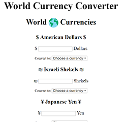
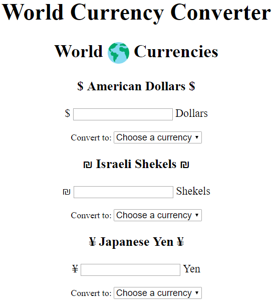
This page features a currency converter. For businesses with an international reach, this converter is very customer friendly. With a quick click a customer in France can calculate the cost of an American product in euros rather than dollars. For example, type $5 into the dollars text box, select Euro from the convert to list and the converting function will display the exchange rate as $5 dollars = €4.03 euros.
Currently, this currency converter works by entering a number and choosing a currency to convert into but it doesn’t have to work that way. If you have an online store which is viewed in multiple international markets the converter could be specific to each country. For example, if you view the online store in America prices will be presented in dollars, viewers in France would see euros, viewers in Mexico pesos, etc.
Another way of automatically converting the price into the right currency is when the language of the website changes a second price appears. For example, if an item is $5 dollars and the language of the site is Hebrew, the price would display as $5 dollars = ₪17.38 shekels. We would still need to put the dollar amount if we linked the language with a currency rate for people who speak a different language, but don’t use that currency--such as Spain and Mexico. While both countries speak Spanish, Spain’s currency is euros and Mexico’s currency is pesos.
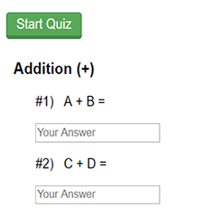
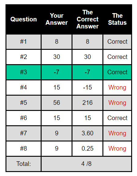
This is a reusable math quiz. Initially, the addition, subtraction, multiplication, and division problems are presented as algebraic equations. For example, A + B = C. Once you click on the green start button the website will generate random numbers to the alphabet letter. For example, A + B =. Everytime you click the refresh button, the website generates new numbers. This allows the math quiz to be reusable.
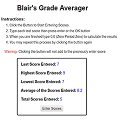
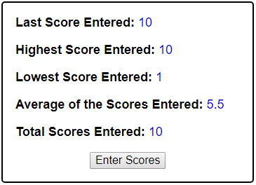
This is a grade averager. This function is really easy to use. Click the “Enter Scores” button and start entering numbers. Press the enter key after each entry. The program will only work with numbers. If you type in a letter a warning message will appear on the screen.as you want pressing the enter key/button after every number.
The averager includes a safety net. They only way to end the averager session is to type in 0.0. This prevents accidentally losing entries before all numbers are entered. Once you enter the number 0.0 the averager will display the following:
This averager can also be used with monetary numbers. Therefore, giving individuals and business pertinent information such as sale quatas, spending patterns, budgeting, etc.
A business may need generate $1,200 a day to keep the business afloat. By entering each days sales into the averager a business can determine with they are meeting their daily quota. A weeks worth of entries might look like this: Sunday-$800, Monday-$900, Tuesday-$2000, Wednesday-$1500, Thursday-$1000, Friday-$1,300, and Saturday-$1200. Using the averager this business generates a daily average of $1243.
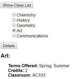
To round out my school themed websites, I designed this online class catalog. Although I have designed it using class schedules, it could also be used to catalog products and/or services.
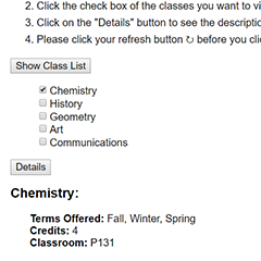
To use this page click the “Show Class List” button. Then select the class(es). Next click the “Details” button. The display will show the name of the class, when the class is offered, how many credits the class is worth, and where the class will be held.
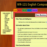
This website came out of a writing class I took at college. The teacher could not find a way to organize her content on the college online classroom service. This resulted in frustration for the students who could not find information and/or assignments and frustration for the teacher who ended up answering numerous “help” emails from students. I approached this teacher with the idea of designing a more user friendly website.
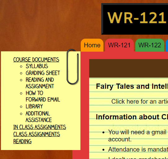
I built the website using colored files on a desk. Each file is clearly labeled as Assignments, Readings, In Class Assignments, and so forth. This made to tool easier for the teacher. She could easily guide students to the applicable file by name and/or color.
One challenge I faced with this website was a function versus fashion need. I felt that a navigation bar would detract from the fashion of the website, but eliminating a navigation bar would make the site difficult for students to use. I came up with the idea of using a “sticky note” paper clipped to each folder. It held to the theme and look of the website while meeting the function of a navigation bar. I even used a font that mimics handwriting.
The website was well received by my teacher. She said that it checked all of her need boxes. The Writing Department us currently reviewing the website for use by department teachers.
Based on a referral from Early Childhood Education Management Services (ECEMS) I was approached by Cedar Tree Preschool. Cedar Three is a new community based preschool. Since it is a very small business, the teacher wanted a website that was easy to use, inexpensive, and easily updatable. After discussion, we decided that Content Managing Website or a Template Website would be the best choice. After researching different costs and different templates, we choose Weebly.com.
The biggest challenge with this project was designing a logo. Cedar Tree Preschool wanted to give a nod to their past while creating something new for their new endeavor. I merged the old logo with a large cedar tree. I chose the branding colors and purchased the domain name. I also produced the logo so that it could easily be added to any marketing and communication materials.
I educated the preschools staff on how to use Weebly and edit their website. They feel that the website more than meets their needs and they feel competent in making changes and additions to the site.
This is a web page is a demonstration of cohesive theming and my coding abilities. The theme of this website is Clackamas Community College (CCC). It features a Google Map of the campus. Each building has a custom icon. Click on the icon and a dropdown list will appear displaying information about that particular building. The custom search engine is linked to the official CCC website, Clackamas.edu.
I had fun with this site. As the site loads the message “50 Years of Education” is typed across the top of the page along with a large Cougar logo and “Go Cougars”. When you click on the Search or Map icons the message and the logo shrink. If you close the map and search bar the cougar logo and the message will regrow to fill the space again. If you click on the cougar logo the message will rapidly resize as if the cougar is growling.
Lastly, I created all the icons for this page along with the feature that allows the search to change colors.
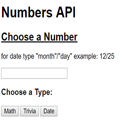
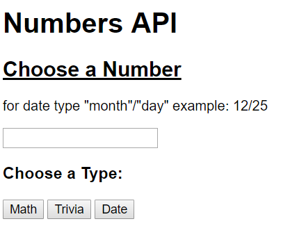
This page is an example of me interacting with an API(Application Programming Interface). An API allows people to access features or information created by another person or company. I did not create the API used on this page. I attached it to this web page so that a person could experience interacting with an API.
This API is all about numbers. Enter any number into the textbox and click the Math button. The API will return a mathematical fact about the number. So thIf you enter a number and click the Trivia button, the API will send a fun fact about the number you entered. If you enter a month and a day and click the Date button, the API will return a fun fact about that day.
If you click any of the lower buttons you will receive a fun fact about a random number. Although this API is only about numbers, API’s can do many more things to make life easier.
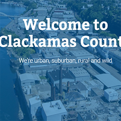
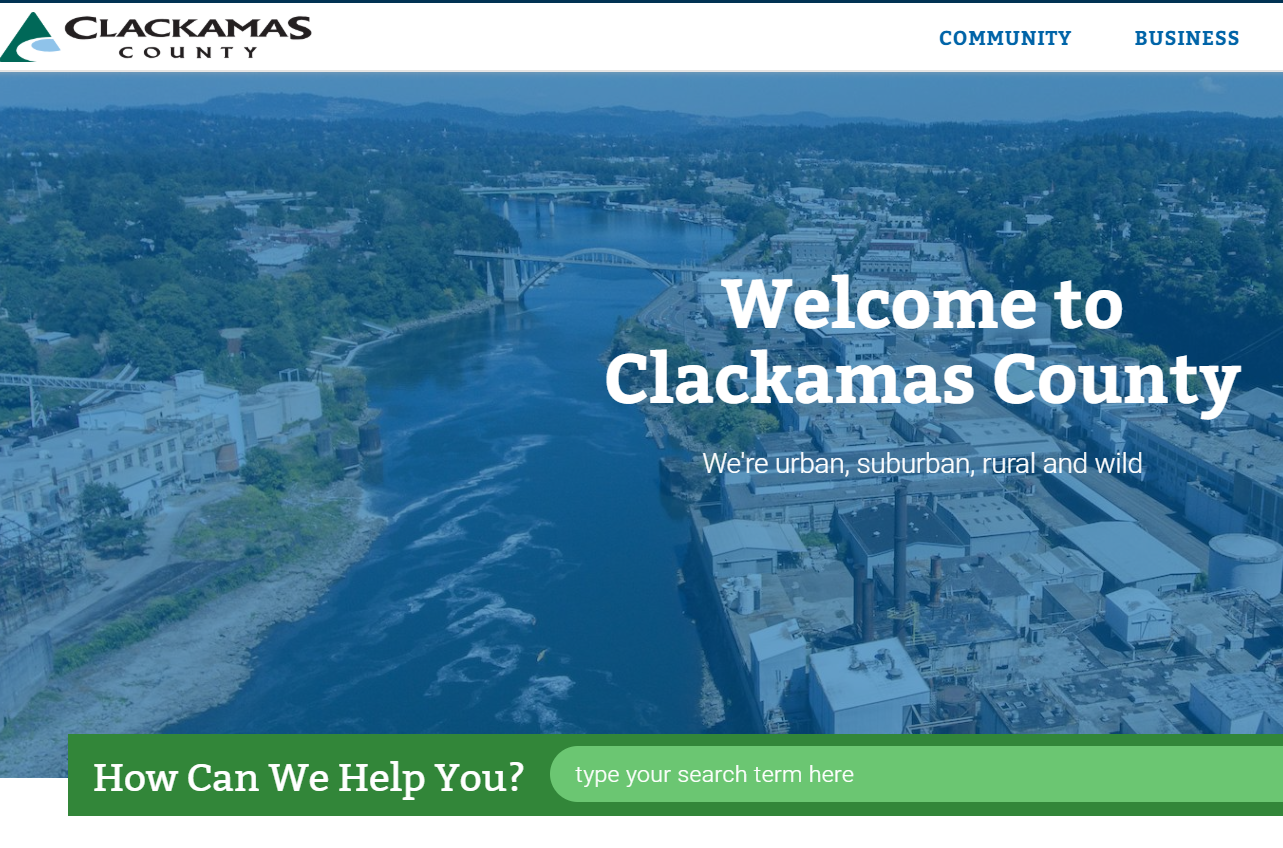
While I was in school, I had the great privilege of being an intern with the Clackamas County’s Technology Services Department. During my time at the county I learned many things and completed many projects. One of my main projects was updating the internal and public county website. My responsibilities included updating the framework of different pages, rebuilding forms, updating/adding information to different pages, testing different features of the website for reliability, and fixing/reporting bugs or problems.